We are approaching 1k readers. Thank you so much for your support. Please help us grow further by subscribing, sharing and Tweeting.
The Weekly KnowHow is sponsored by new company modelling platform Stellar Fusion. Dynamic company models built by real analysts to help you invest with knowledge. Sign up to get access on launch. Coming Soon!
Charts of the Week:
The aim of this product is to highlight some interesting charts that support our current views, challenge the consensual view or are simply just interesting to share. As always, if you ever have any questions then feel free to reach out.
1. No end to rising temperatures: If you haven’t read this report then we would fully recommend doing so. The first major assessment from the UN-backed Intergovernmental Panel on Climate Change in nearly a decade sees no end to rising temperatures before 2050.
2. Perhaps it is transitory? This is fantastic chart from @DataArbor showing many of the most-watched measures of the disrupted supply chain from flatbed rates per mile to supplier delivery times rolled over in May/June. Peaks since 1960 suggest 10 to 12 months to get back to the mean.
3. EM QE to stay? A month or so old but the story remains the same. @ExanteData asks the question: Does the pandemic mark the beginning of a new regime of balance sheet activism by EM central banks; or was the pandemic intervention only a one off?
4. The fast-growing $15 club: It is interesting to see the average hourly earnings for non-managerial employees in the US and how fast they have risen over the last year for sporting goods and musical instrument stores versus supermarkets.
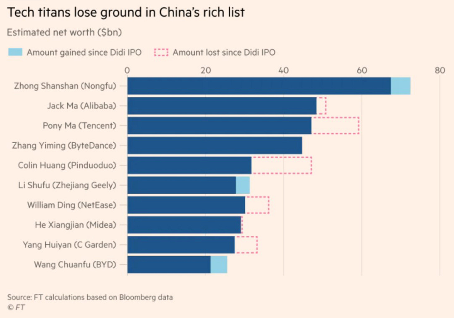
5. How much have tech titans lost since Didi IPO: As many of our regular readers will know, we had a big debate internally about whether we should add $BABA to our portfolio and in the end one analyst used their veto. Even post the continued sell-off we don’t believe we are at the ‘bear case’ for many of the Chinese tech names and see potential for further downside. With this in mind, while there aren’t many conclusions to take from it we thought this chart from the FT was interesting.
6. Valuations of EM stocks have slumped relative to their DM peers: The Chinese clamp-down will certainly have had an impact but southeast Asian coronavirus worries have also weighed on EM stocks. Against this backdrop, emerging-market stocks continue to get cheaper. Emerging-market stocks approach a 20-year low versus U.S shares.
7. Asset class performance in inflationary regimes: This is a great chart from @InvestorAmnesia looking at the performance of various assets in specific inflationary regimes going back to World War II.
8. USTs and IG Credit behaviour: Another cracker from @DataArbor looking at how fast USTs and IG credit have resumed negative correlation to risk assets, namely the S&P 500.
9. Breadth continues to worry: We have spoken on this a number of times recently and this chart from Morgan Stanley once again highlights the worries we have. The % of stocks trading above the 50 Day moving average is below 50% for the S&P 500 and it’s much worse for lower quality indices.
10. Inflation outperforming wage raises: This white paper from Jason Furman and Wilson Powell of Harvard University is worth reading. Overall real compensation is down 0.7 percent since December 2019. Real compensation would have been expected to rise over this period, so relative to trend it is down 2 percent (figure 4), with a similar shortfall for real wages.


