The aim of this product is to highlight some interesting charts that support our current views, challenge the consensual view or are simply just interesting to share. As always, if you ever have any questions then feel free to reach out.
1. Snap vs TikTok Average Daily Time on iOS – US: We had a number of lively debates on $SNAP last week and how incredible product innovation/R&D has kept driving user growth however we are wary that they are targeting an audience that needs constant innovation. For us $PINS and $TWTR have better profitability models in the Long-Term. With this in mind, it is interesting to see that chart below.
2. Why markets may not be at peak… This chart is interesting in the context of the view held by Jurrien Trimmer from Fidelity. In this post, he suggests that the secular the bull market could continue for years to come as long as current trends continue in earnings, the payout ratio, and the risk premium.
If you find our work valuable, please like, subscribe and share. We rely on that to grow our subscriber base. This is real analysis by real analysts. Enjoy!
3. The great retail unwind? We mentioned this last week. It is interesting to see that retail investors upping exposure again in recent weeks, especially given we have been debating a reopening retail unwind. It doesn’t seem to be happening…
4. Why did you cancel your Netflix subscription? Another cracking chart from @HedgeyeComm. From a survey of 1,250 households, it is clear the pricing is becoming increasingly cited as to why households are cancelling their subscription.
5. How does Bitcoin fare as a Monetary Hedge? As the chart shows, as a monetary hedge bitcoin could be seen as a high-octane version of silver, which in turn is a high-octane version of gold. Plus, the dots are more skewed to the upside than the downside, indicating a favourable risk/reward.
The KnowHow Capital Portfolio is now live. Subscriber access only below.
6. ECB support unwavering: The charts below show the ECB’s commitment to low yields and also shows it is not worried about high debt and stagnation.
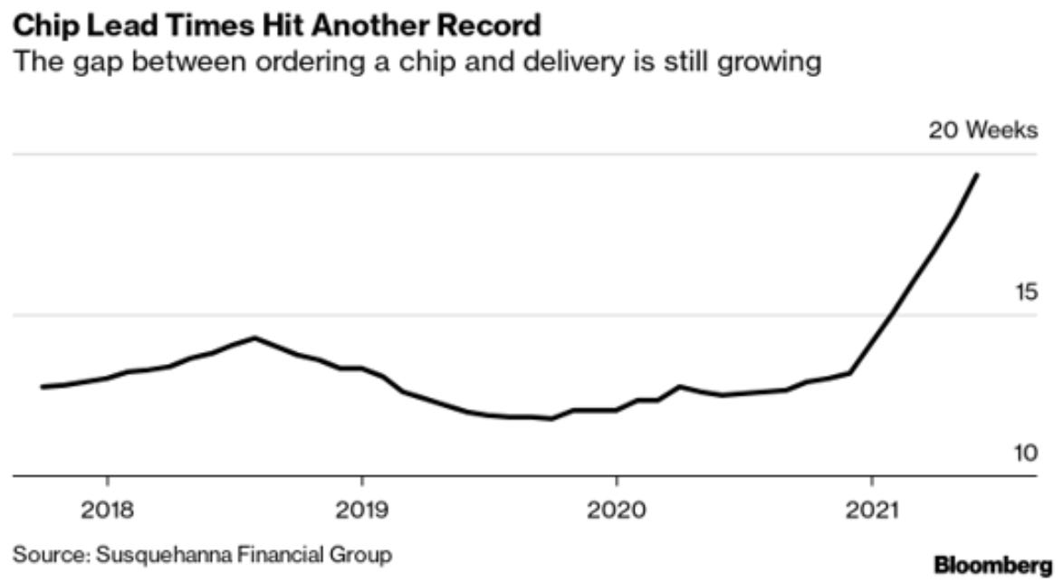
7. Chip lead times continuing to grow: We have spoken about the chip shortages a fair bit over the course of this year, and it is interesting to see this is not abating. It now seems unlikely that this is set to recover by the end of this year / early 2022 as many expect with some saying that this could even continue into 2023.
8. S&P Announced buybacks not as high as this chart suggests: This chart form JPM suggests that SPX Company Announced Share Repurchases 2021 is currently on track to beat the 3-Year avg. One point we would make is that this will actually be below 2019 if you look at the data as a % S&P market cap.Not as good as it seems but we may see an acceleration towards the end of 2021.
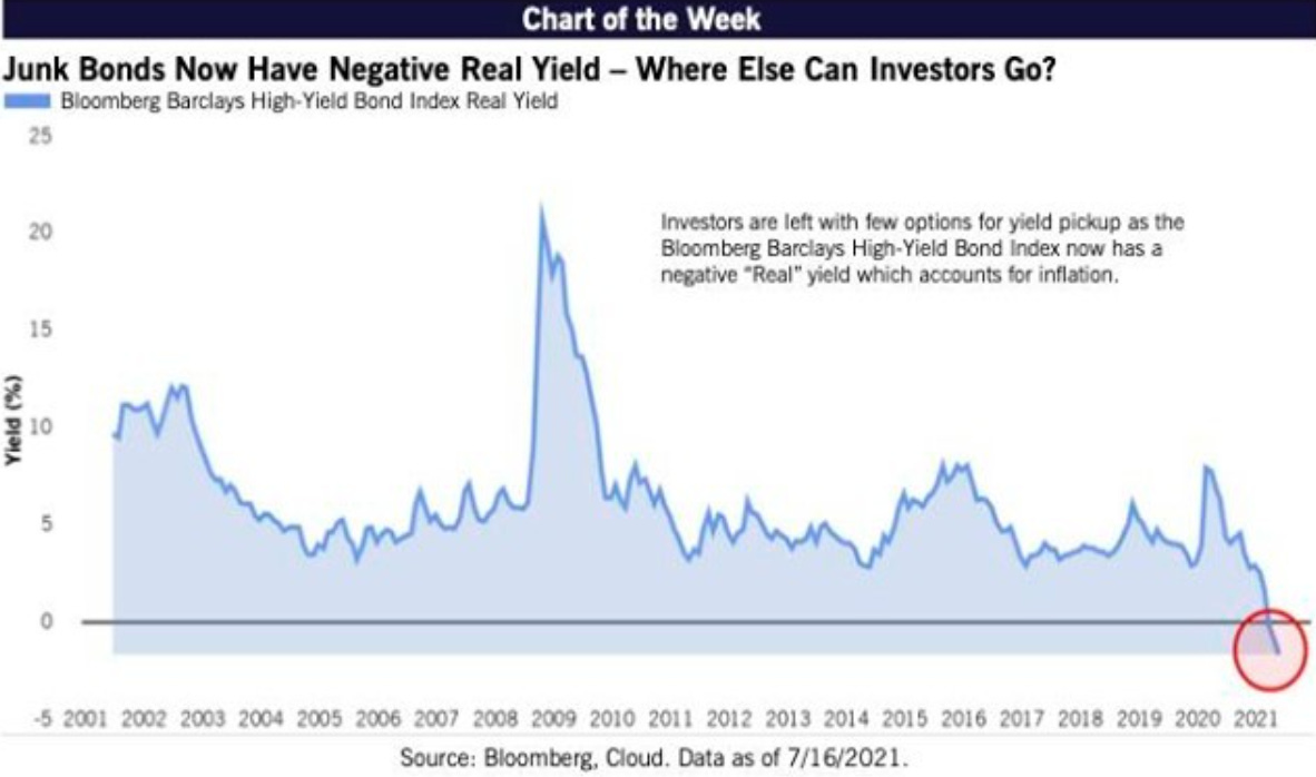
9. Junk Bonds now have a negative real yield: We track this index closely and with real yields continuing to track down and turn negative, you can see why asset allocators continue to find equities attractive.
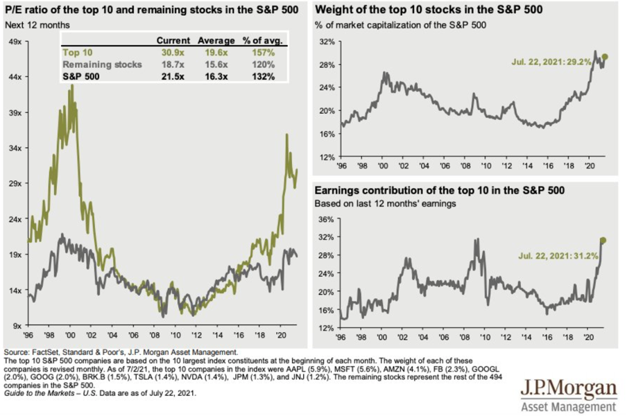
10. Breadth of the S&P continues to shrink: Another great chart from JP Morgan Asset Management looking at 3 different metrics over time for the Top 10 largest index constituents at the beginning of each month. As you can see we the moves in the last year are taking us back to the late 1990’s and 2007 levels.


