If you find our work valuable, please like, subscribe and share. We rely on that to grow our subscriber base. This is real analysis by real analysts. Enjoy!
The aim of this product is to highlight some interesting charts that support our current views, challenge the consensual view or are simply just interesting to share. As always, if you ever have any questions then feel free to reach out.
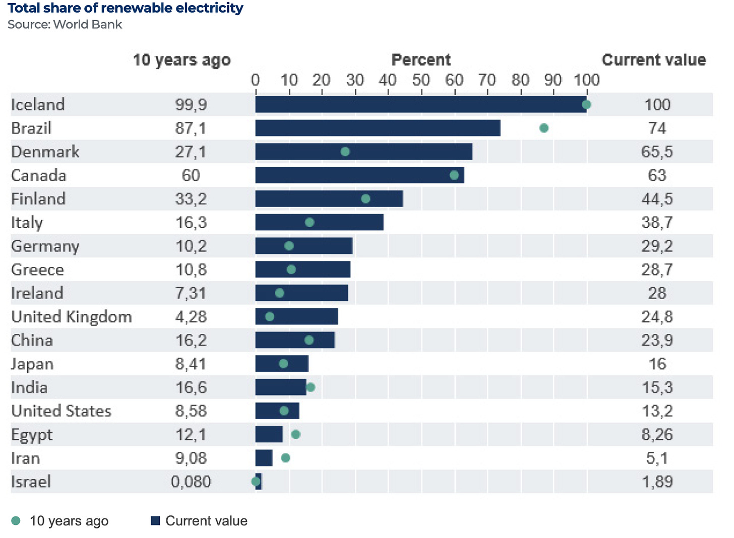
1. Global share of renewable electricity by country: If you haven’t read this paper from Macrobond that charts the economic impact of climate change then it is well worth reading. Financial professionals including economists, analysts, quants, strategists, portfolio managers and asset allocators use these data sets to inform macroeconomic and financial analysis. The chart shows which countries have made the most progress in the transition to renewable energy sources.
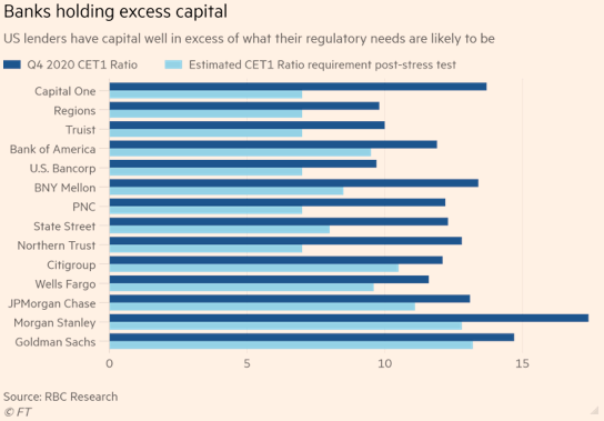
2. US Banks gearing up for buyback bonanzas? Twenty-three banks, including JPMorgan Chase and Goldman Sachs, underwent “stress tests” by the Fed that modelled the financial damage from a series of doomsday scenarios. These included a US stock market crash, a steep drop in economic output and substantial distress in commercial real estate. The results, released on Thursday, pave the way for billions of dollars in stock buybacks and dividends, which bank investors have been eagerly anticipating.
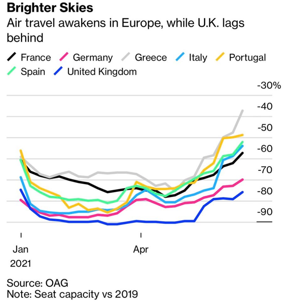
3. European air travel taking off? While the UK is still lagging, it is interesting to see that European air travel is starting to pick up as we head into the summer holidays. There is some way to go here to get anywhere near a normalised 2019 level but the growth in some countries is certainly positive.
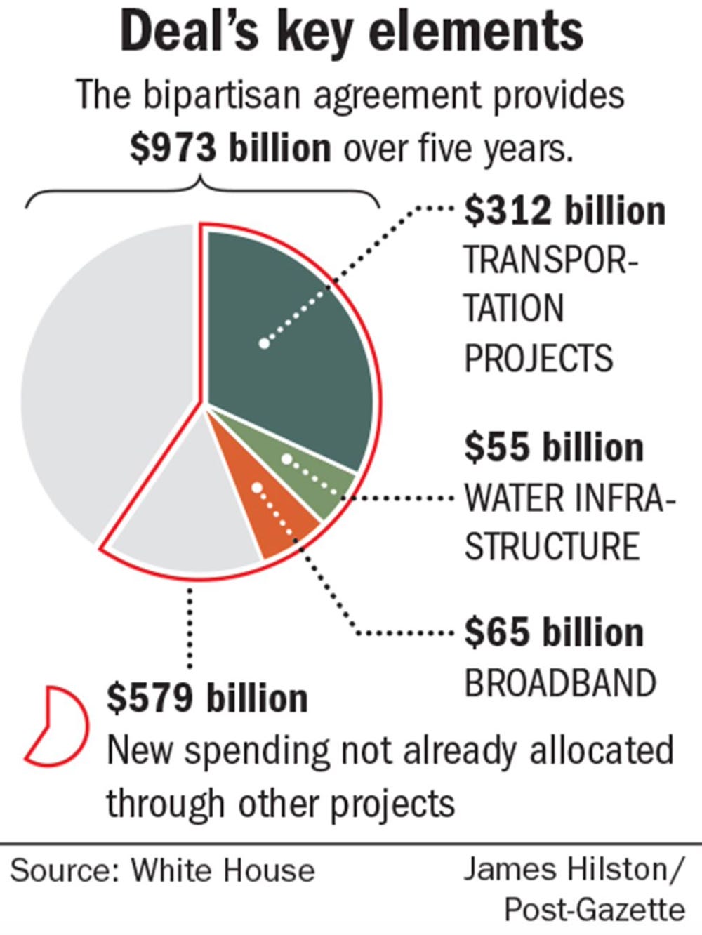
4. What is in Biden’s Infra Bill? President Joe Biden announced on Thursday a hard-earned bipartisan agreement on a pared-down infrastructure plan that would make a start on his top legislative priority and validate his efforts to reach across the political aisle. The bill’s price tag at $973 billion over five years, or $1.2 trillion over eight years, is a scaled-back but still significant piece of Mr. Biden’s broader proposals. While the full details are still relatively unknown, the chart below is a useful illustration of where the spending will go.
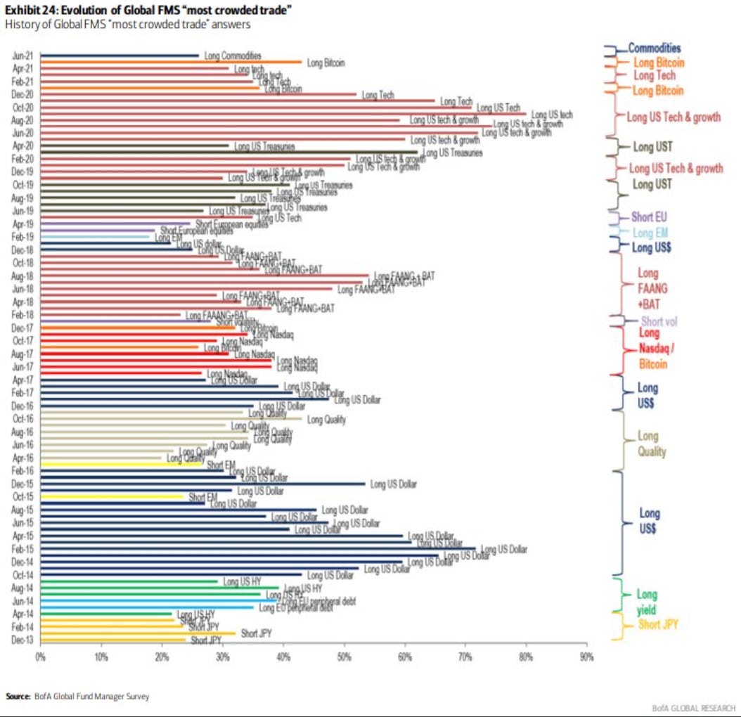
5. What is the current most crowded trade? This is a fantastic chart from the latest Bank of America Fund Management survey. This chart shows the full history of the most "crowded trade" according to BofA's monthly Global Fund Manager Survey. The market leadership has been relatively narrow since 2013, shiſting from high yielding debt; long US$; long Quality; long Tech; long Emerging Markets; long US Treasuries, long US tech & growth stocks, long Bitcoin. Long Commodities is top with 26% of FMS investors saying it is the most "crowded trade"; #2 Long Bitcoin, #3 Long Tech, #4 Long ESG.
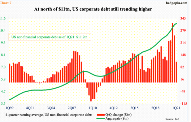
6. Is corporate debt accumulation getting excessive? On the corporate front, Hedgopia is suggesting that debt accumulation is getting excessive, to a point when non-financial companies were sitting on record outstanding debt in 1Q21. At $11.2 trillion, corporate debt has been north of $11 trillion the last four quarters. A four-quarter average helps us get a sense of the underlying trend, and it has been nothing but up on that score, from bottom left to upper right of the chart.
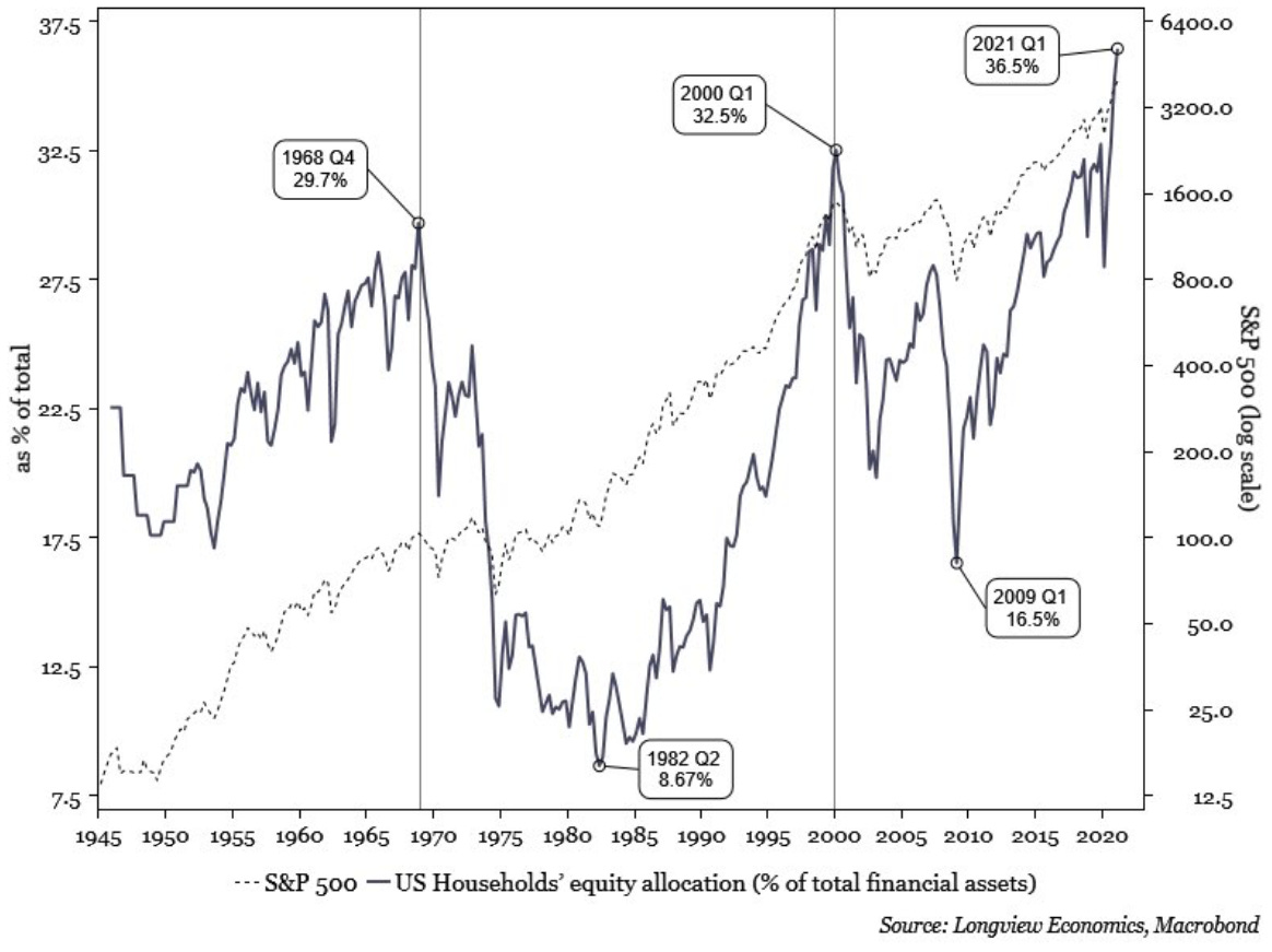
7. What about US Household equity allocation? The below chart certainly suggests that US households’ equity allocation is excessive. At 36.5%, Q121 allocation as a percentage of total financial assets is at the highest it has ever been and even higher than the dotcom boom back in 2000…
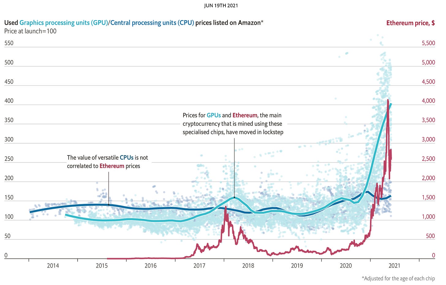
8. Are Crypto-miners to blame for the graphics-chip shortage? This graph from The Economist using data from Keepa, a website that tracks Amazon listings, shows that asking prices for gpus have risen faster than those for central processing units (cpus). The data also suggest that miners of Ethereum, the second-largest cryptocurrency, are to blame for gamers’ woes.
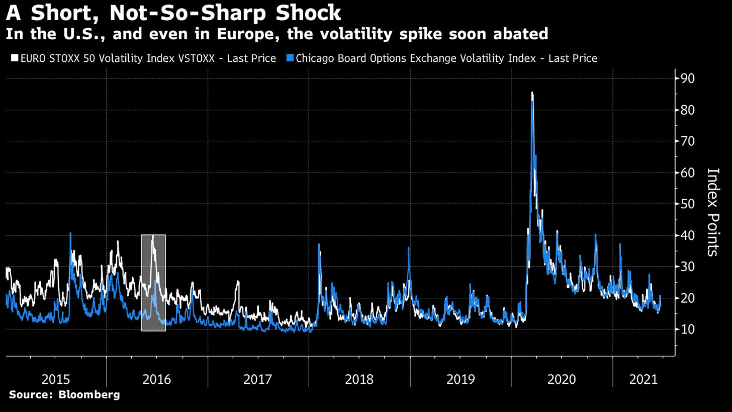
9. Volatility in Europe and the US continues to trend lower: It is interesting to see that in Europe, volatility on the Stoxx index and the equivalent of the U.S have continued to trend lower as the year has gone on. This, in the context of increasing inflation and taper tantrum worries, is interesting in our opinion.
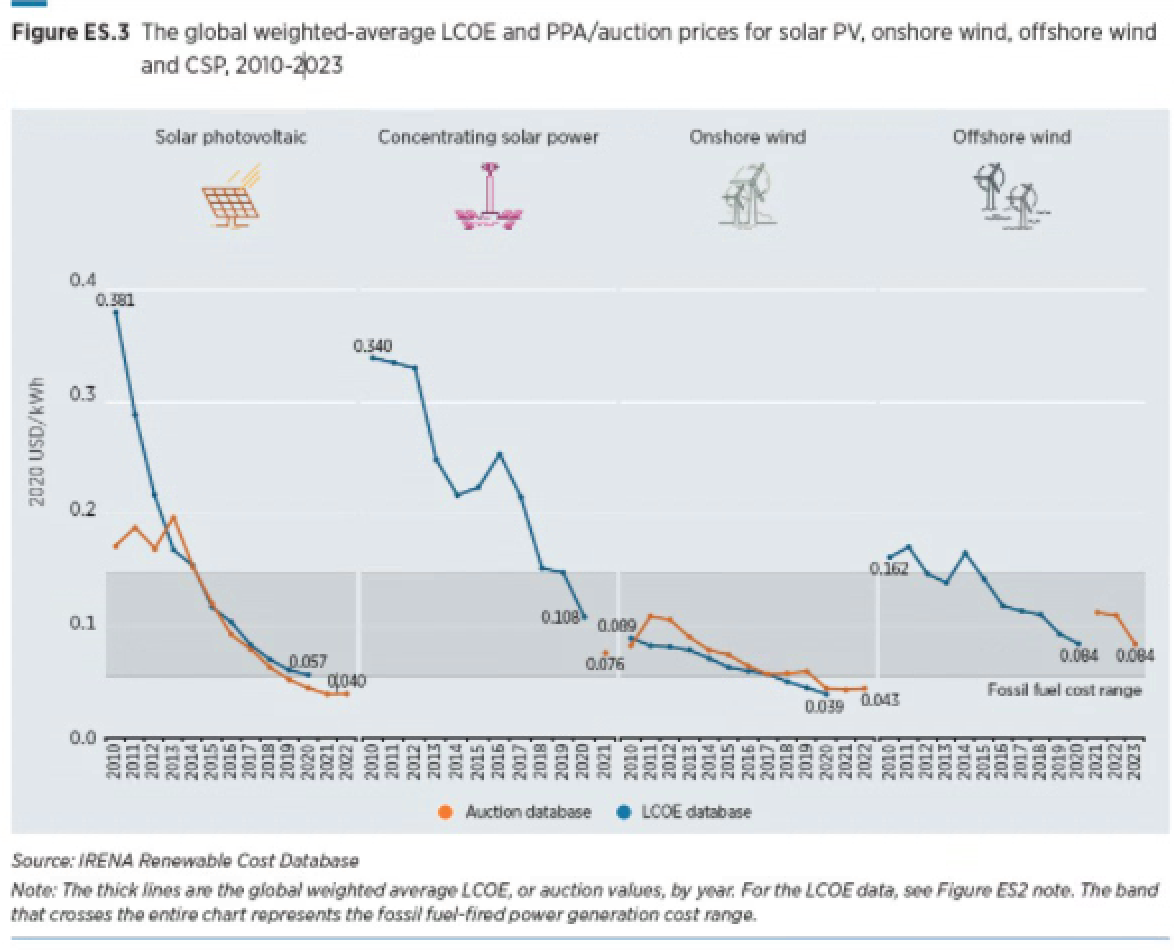
10. New renewables now beating most operational coal: As you can see from the below chart, in general, wind and solar have both comfortably fallen below even the cheapest fossil fuel options and concentrating solar power and offshore wind will likely both drop below the fossil fuel costs range in coming years, assuming continued developments.


excellent macro snippets. enjoy reading. on fed stress test, one thing that stands out is how well European banks performed. https://twitter.com/siyul/status/1408844598601031687?s=20