The aim of this product is to highlight some interesting charts that support our current views, challenge the consensual view or are simply just interesting to share. As always, if you ever have any questions then feel free to reach out.
1. Is the cycle set to peak in August? The risk for the Fed is that the overall credit/economic impulse is starting to fade. Judging from historical correlations between the yield curve and manufacturing activity in the US, we are within one to two months of the cyclical peak, which means that key figures will likely start slowing from a momentum perspective as early as during the early autumn. As the Fed is more focused on core inflation and unemployment, both of which tend to lag the cycle, this may be of little relevance for the Fed right now, but it may make the taper sequencing process a bit bumpier during the autumn than otherwise.
2. Bitcoin pullback a bump in the road? Another great chart from Jurrien Timmer from Fidelity. Below, he shows bitcoin since its 2019 low against gold during the '70s. Price analogs are highly subjective, but clearly, gold’s price discovery was highly volatile, much like bitcoin today. By this measure, bitcoin’s current 50% drawdown could be seen as a bump in the road.
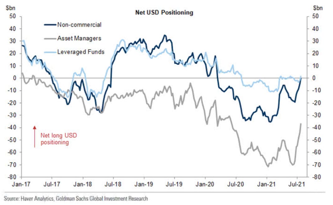
3. USD positioning normalising? Asset managers and non-commercial traders have decreased their net short positions in the US dollar. Non-commercial and leveraged positioning is now flat while Asset Managers have cut their short positioning in half since the June lows.
4. Europe’s expensive plan to reach the top tier of chipmakers: There was a great Big Read out last week in the FT on Europe’s attempts to up its game in the manufacturing of semiconductor chips. Europe, of course, is far from the only region looking at this. But with auto manufacturing one of the industries to be hardest hit by production shortages during the pandemic, it has some cause to improve capacity.
5. US equity uptrend appears intact? According to Standard Chartered, US equities’ uptrend looks intact. The #SP500’s rebound from quite strong support at the May high of 4,238 signals the recent slide in the market a few weeks ago has not altered the structure of the uptrend.
6. Fintech deals are not slowing…. On a day where $SQ is making all the headlines in the space, we thought we would revisit a very interesting chart looking at the space in 2020. As @mukund says, 1 in every 5 dollars of Venture Capital is now invested in Fintech, making it by far the hottest sector in all of tech
7. What have we leant from past QE? With talk of tapering abound, this chart from @AndreasSteno is a timely reminder of what happened to bond yields when QE1, QE2 and QE3 ended. Bond yields immediately plunged. We might soon find out that US 10y yields can currently only be held ABOVE 1% by massive QE.
8. Inflows into EM starting to turn higher: It is interesting to see, after a period of small outflows, inflows into EM equities are once again ticking up.
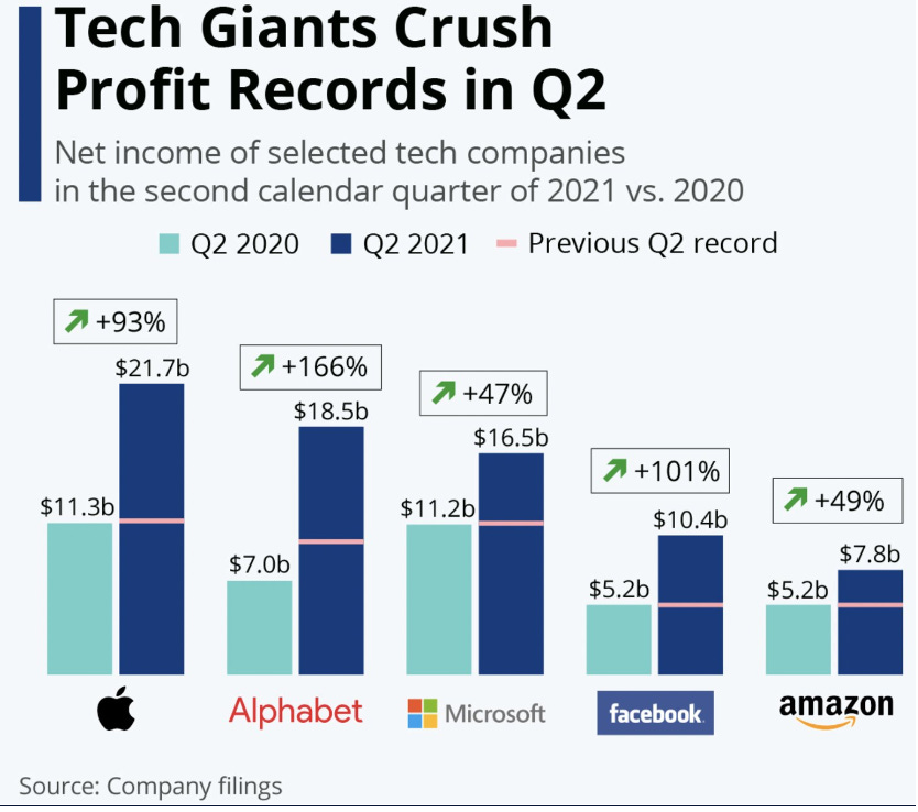
9. Tech Giants Q2 crushing records in Q2: Another quarter and more records broken by the tech giants. While the share price reactions may not have told the full story, the ability of these giants to post such large increases in profits is exactly why we have seen so many investors keen to buy on any weakness.
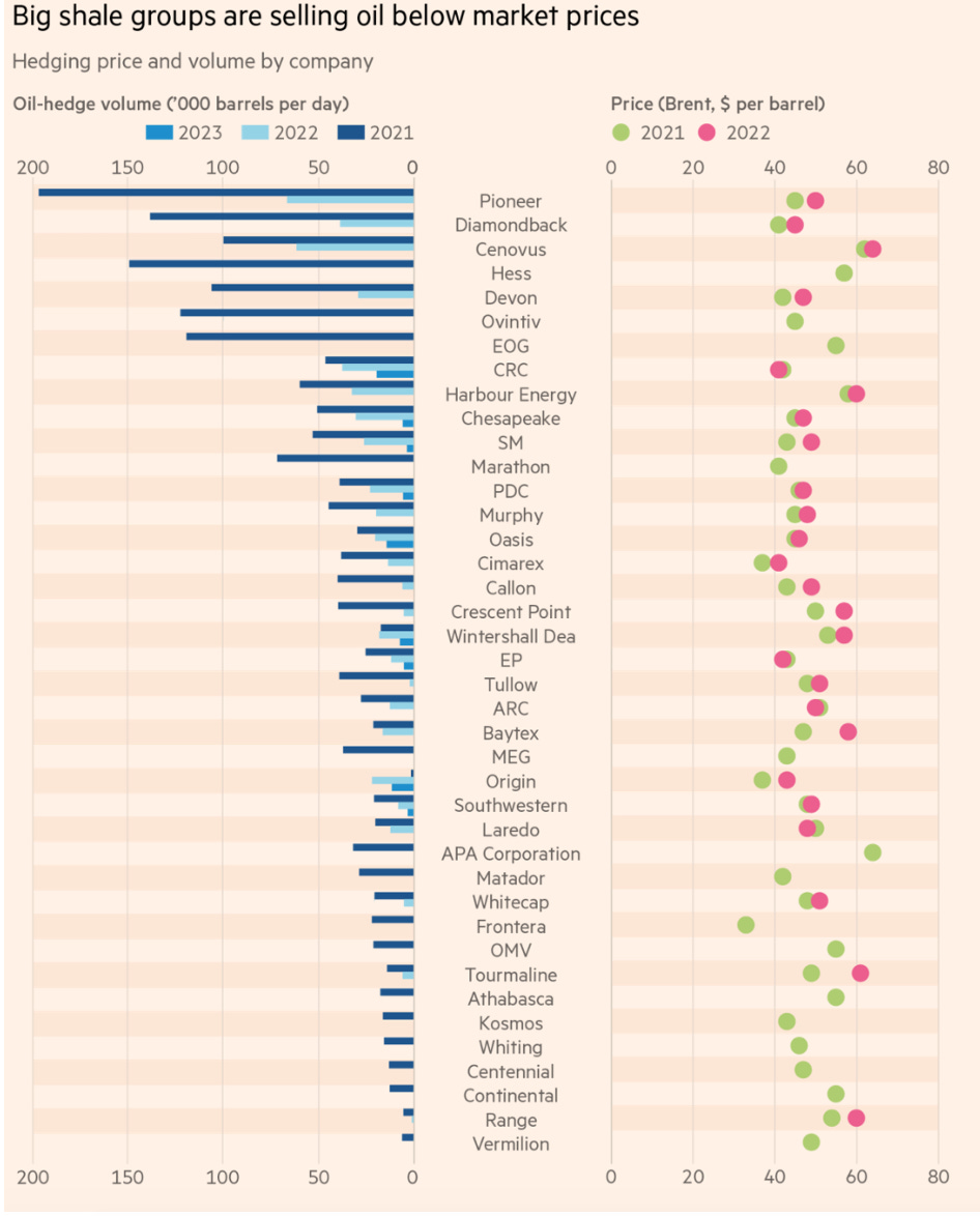
10. Opec ‘gets a pass to lift oil prices’ as hedging losses hobble US shale: Some of America’s biggest oil groups are racking up tens of billions of dollars in hedging losses despite soaring crude prices, as contracts signed during last year’s crash leave them selling their output at deeply discounted prices.


