The aim of this product is to highlight some interesting charts that support our current views, challenge the consensual view or are simply just interesting to share. As always, if you ever have any questions then feel free to reach out.
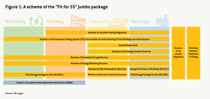
1. What does Fit for 55 actually mean? If you haven’t read the European Commission’s “Fit for 55” report then this is something we recommend over the weekend. The chart below highlights what the jumbo package consists of and how the EUcan hit its ambitious targets for reducing net emissions by at least 55% by 2030.
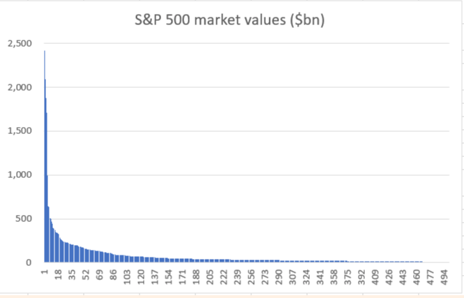
2. Market breadth continues to be a worry: We spoke on this exact topic a few weeks ago (here) but the FT picked up on the same topic this week. One chart, in the note, shows that the top ten companies in the S&P have almost as much market value ($11.8tn) as numbers 101-500 combined. The top 100 have more than two-thirds of the index’s value. Another way to look at the same point is below. The distribution of value in the S&P, 1 through 500, looks like this:
If you find our work valuable, please like, subscribe and share. We rely on that to grow our subscriber base. This is real analysis by real analysts. Enjoy!
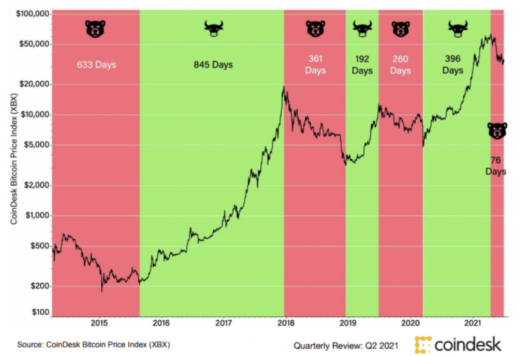
3. Bitcoin Bull / Bear Cycles: As all investment managers will tell you, historical performance is not a guarantee of future results, but it is interesting to see the breakdown of the bull and bear markets for bitcoin since 2015. According to Coindesk’s latest (June) quarterly review, we are more than 76 days into a bear market (defined as a drop of at least 20%, followed by at least 90 days in which the price does not return to its previous high or low).
4. SPX Option Market suggesting an exhausted market? Chart of the week is from @Theimmigrant84, and what a chart it is. This chart shows SPX option market open interest (left) and moneyness (bottom)for all expiries. 100% represents the ATM spot option. Biggest positions are around spot. Investors seem to think that market may have exhausted it all ... maybe
The KnowHow Capital Portfolio is now live. Subscriber access only below.
5. Why is Netflix going into video games? We had a few questions yesterday asking us why $NFLX is going into video games and what the opportunity could be for them. While it is too early to really evaluate this, the chart below shows just why they are looking to enter this growing industry. While not stated on the graph, this market is looking to grow by CAGR of 12.9% from 2020 – 2027. This chart was also from May 2020 so we would expect the base level from 2020 to be higher given circumstances.
6. Are investors prepared for post-Covid markets? It is a few weeks old, but the 2021 Global Survey of Individual Investors carries out by Natixis suggests we are all overly optimistic on the returns we expect. The survey of 8,550 investors in 24 countries suggests that there is a substantial gap between what individual investors expect and what financial experts say is realistic. As a result, the global expectations gap now stands at 174%, or 53 percentage points higher than what Natixis found in 2020.
7. Alibaba’s Strategy: Given the debate we had internally (and on Twitter) as to whether we should add BABA to our portfolio, we thought this chart was interesting. Thanks to @JoshuaTai0427 for this. This picture sums up $BABA's strategy quite well. Acquire more and more businesses (especially social medias and entertainments), build an integrated system, and track a lot a lot of user data so $BABAcan make the best shopping suggestions when the user shops.
8. US Gambling desire continues to rise: There are many ways to play the US gambling theme this chart is highlighting below. In the US you can go for the pure play casino names (e.g $MGM) or in Europe you can play by the theme through the likes of Entain or Flutter who are both making great strides into sports betting in the US. For us $ENT is the way to play it given the valuation discount
9. Chinese financed projects: While ‘Vaccine Diplomacy’ may not be going as planned for the Chinese, this chart below highlights just how wide-reaching the One Belt One Road initiative is. This is particularly relevant as this week the EU agreed on an Infrastructure Plan to Rival China’s Belt and Road initiative. The initiative will pale in comparison to the below but is still ambitious.
10. Micro Caps underperforming the S&P: This week we mentioned on twitter how the recent small cap underperformance is a very good indicator of de-grossing and positioning rebalancing. This tells you investors just reducing risk ahead of earnings which is painful but not necessarily a bad thing. The chart below highlights this point very well
11. Direct Lending for PE firms hitting records (again): We have spoken about the huge rise in PE transactions a number of times over recent weeks but what is also interesting is that as more money flows into direct lending funds, what was once a niche corner of the debt market is becoming a more common way to finance large buyouts, enabling private equity firms to circumvent the banks that typically help finance such deals via high-yield bonds and leveraged loans.
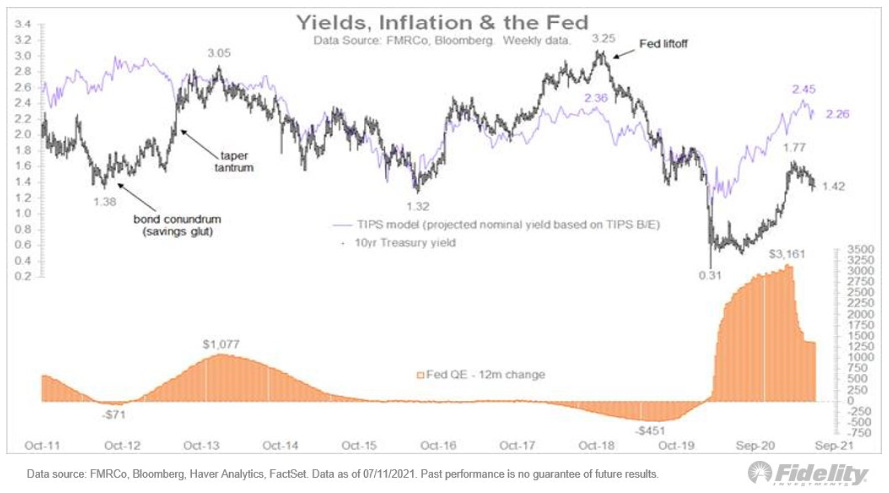
12. Bonus - Yields, Inflation & the Fed: It would not be a weekly without a mention of these three. Jurrien Timmer from Fidelity pointed out this week that based on the regression between these two variables, the current level of the 10-year is about 100 bps lower than it “should” be. This chart shows the 10-year vs the above TIPS model. Are today’s subdued yields the result of policy?


