If you find our work valuable, please like, subscribe and share. We rely on that to grow our subscriber base. This is real analysis by real analysts. Enjoy!
In this week’s KnowHow:
The Financial Crisis redux
Putting the current rotation into context
Opportunity to reposition
For a few weeks now, we have been arguing for a rotation back into growth for a couple of reasons: i) peak macro data means earnings momentum for cyclical, more “value” orientated sectors is starting to wane and, ii) positioning had become extended in favour of the cyclical trade. Over the past month, that trade has reversed with a vengeance. The Nasdaq has outperformed the Dow by 5% and is now almost inline on a year-to-date basis, while the ARKK ETF is up almost 15%. The question we are now trying to answer is how much further this rotation has to go.
The Financial Crisis Redux
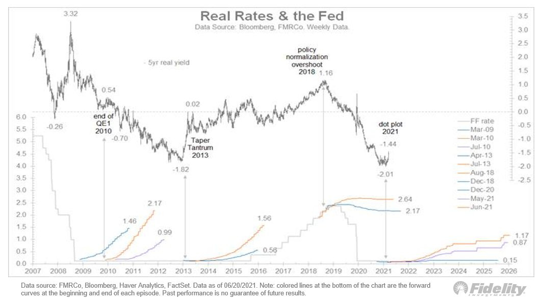
Lets’ start by revisiting the rate dynamics post the Financial Crisis. Remember, we have done this a few times in recent analysis and the reason is very simple; there are a number of similarities relating to both fiscal and monetary stimulus. Looking at the below chart, from the excellent Jurrien Timmer at FMR, you will see that we have also been following a very similar post-crisis trend in real rates. As Jurrien points out, as macro data peaked through late 2009, inflation expectations stabilised but the market accepted the Fed policy pathway and real rates continued to drift lower. Aside for the initial spike in yields in Q1, we have been seeing a similar trend through 2021.
Of course, there are also differences today that are worth appreciating. We are starting from a much lower base when it comes to real rates but then the size of both monetary and fiscal stimulus has also been significantly larger. That will drive much greater volatility in rate dynamics versus 2009-10. However, the demographic, technology and capacity issues that we have discussed in the past as a cap on long-term inflation, haven’t gone away. Our view has been that yields have room to rise over the coming months as the macro data peaks but remains at a strong level. However, the long-term trends continue to cap that trajectory, not least of all the fiscal cliff in 2022.
What’s interesting in Jurrien’s chart above is what happened to real yields even as QE peaked in mid-2009 and Fed purchases continued till 2013. Real yields continued to fall until the Fed was explicit about tapering. It would appear that we are at least a couple of quarters away from that event even if we should expect a reduction in mortgage backed securities in our view.
As an aside, if you are on board with that view, having some gold in your portfolio, or gold miners, wouldn’t be a bad trade for diversification.
Nike, Adidas and Lululemon's Social quest?
Our analysis of the Social issues relating to the biggest sports brands is out now as part of our ESG Insights product. If you would like to read the whole note, please subscribe below and access here.
Putting the current rotation into context
Let’s now take that rate playbook of 2010 and see what it means for stocks and in particular, the current growth vs value rotation. In the below chart, we are looking at the relative Breadth of Member Performance (based on 50 day moving averages) for the S&P Growth and S&P Value during both the Financial Crisis and the recent Pandemic. What we see is a remarkably similar pattern today to the Financial Crisis and the same three phases of market recovery we have discussed in the past: i) initial growth recovery, ii) rotation into cyclicals and value, before iii) a longer market consolidation as we hit mid-cycle.
In fact, the relationship vs the Financial Crisis, is even stronger if we consider the breadth between the Nasdaq and the Dow Jones.
What this tells you is that the precursor to the market consolidation, or Phase 3, is an initial growth rebound for around a quarter. This pattern held true during the Financial Crisis until we hit the Taper Tantrum in 2013, around 1200 days in the above charts. And, even then, what we saw was a broad market correction rather than any dramatic shift in factors.
Opportunity to reposition
However, for the GAACs (Growth At All Cost) there is a need for caution. We have said before that Phase 1 of the recovery is driven by a valuation re-rating in growth stocks. The GAAC approach works well in that scenario as growth expectations have been rebased and valuations also reset. That in turn means that the highest growth stocks deliver the quickest returns. But, that is very different in this rotation and in the consolidation phase. As you will see in the chart below, Phase 3 sees little change in the relative market multiples between growth and value. Post the Financial Crisis, the 50% premium of Growth vs Value on an EV/Sales basis, held fairly steady from 2010 through to 2016.
What does that mean for your portfolio allocation? This rotation is an opportunity to start repositioning. There is less room for a broad increase in market multiples and earnings expectations across both cyclicals and growth stocks are already high. The stocks that will outperform will be those that have room to re-rate and where expectations aren’t elevated.
NOTE: for paid subscribers we have screens available that highlight stocks that fit our target parameters. We will publish these next weeks but if you can want to access before hand, please shout. Additionally, if you want us to run a factor check on your current portfolio, please send through tickers and we will aim to get this to you within 24 hours.


